
Monday, January 24, 2011


Star Plot
A star plot is a method of representing multiple variables in one graph.


In this star plot 7 variables are represented for 6 different designs.

Black and White Aerial Photo
Black and White aerial photo is a basic photo from above that is lacking color. Only black and white color is visible.

Bivaiate Choropleth Map
A Bivaiate Choropleth Map shows two sets of data on one map by combining colors.


Unclassed Choropleth Maps
Unclassed Choropleth Maps do not plot classes of data but simply a change in the shade of color to represent data.

Classed Choropleth Map
A classed choropleth map is a color coded map on which the data displayed by the colors is ranges or classes.
Increasing or decreasing the number of classes can dramatically alter the appearance of the data.

Increasing or decreasing the number of classes can dramatically alter the appearance of the data.

This map displays 6 data classes for males/100 females.
Continuously Variable Proportional Circle Map
Continuously variable proportional circle map is a proportional circle map in which the size of circles are relative to the data collected.

This is map shows the relative width of the river.
DOQQ
Digital orthophoto quarter- quadrangles are photographic maps to a resolution such that each pixel represents 3 square feet on the ground.


DEM
DEM (digital elevation model) is a map showing elevations of land or sea floor. They are computer generated elevation or topographic maps.


LDAR
LIDAR, or Laser Imaging Detection and Ranging, is a method of detecting distant objects and determining their position, velocity, or other characteristics by analysis of pulsed laser light reflected from their surfaces. LIDAR is used to create topographic maps.

Detail of topographic map created using LIDAR technology
Isohyets
Isohyets are lines on a map depicting equal amounts of rainfall.
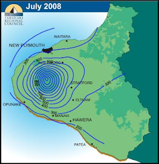
The contour lines on this map are isohyets. They show the distribution of rain fall over a period of time.

The contour lines on this map are isohyets. They show the distribution of rain fall over a period of time.

Isopach
Isopach maps are similar to other isoline maps but the contour lines on an isopach map depict stratigraphic data such as geologic deposits.


Isopleths
Isopleths are isolines that show a variable such as average rainfal that is calculated.

This isopleth uses color to show PH of rain across the country.
DRG
DRG or digital raster graph are scanned images of USGS topographic maps. These images are raster images as opposed to vector images and limited in scalability and resolution.


A sample of a USGS digital raster graphic.
DLG
DLG or Digital Line Graph is a digital representation of the features shown on a U.S. Geological Survey topographic maps. DLGs are in vector format and available as layers which contain different types of data

A digital line graphic from the USGS.

Box Plot
Box plot diagram is graphically depicting groups of numerical data.

This is an example of a box plot.
Parallel Coordinate Plot
A parallel coordinate graph is a visual chart showing the difference in a collected amount of data.

A parallel coodinate graph
Population ProfileA population profile is a chart showing the number of people as a function of their ages.
A population profile is a chart showing the number of people as a function of their ages for a specific geographical area.

This population profile shows the percentage of the total population by age for both male and female. The data is from the 1998 census of Mobile County.
Index Value Plot
Index value plot shows the average range within a time period to give an average mean.

An index value plot of stock index values over a period of months.
Climograph
A climograph is a visual of the monthly precipitation and temperature conditions in one particular place.

Climograph showing the average temperature and precipitation by month for Memphis, TN.
Bilateral Graph
Bilateral graphs show two like variables that are identified and their overlaps.

Bilateral of the position of slave and master in robotics operation.
Triangula Plot
A triangle plot or a ternary plot is a plot of three variables It graphically shows the ratios of the three variables as positions in an equilateral triangle.

Trangle plot of results of parliamentary election in Great Britain.
Wind Rose
A wind rose is a graphical tool used by meteorologists to give a succinct view of how the wind speed and direction are typically distributed at a particular location.

A wind rose showing direction and intensity of wind at a given location.
Scatter Plot
A scatter plot or scatter graph is a type of mathematical diagram using Cartesian coordinates to display values for two variable for a set of data.

A scatter plot showing the relationship of income to years of experience within the sample
Stem and Leaf Plot
Stem and leaf plots are a method used for showing frequency among common numbers. Simply grouping like numbers to show frequency.

An example of a stem and leaf plot
Isobars
Isobars are a type of isoline which deal specifically with barometric pressure. They are use on weather maps. They connect points of equal baraometric pressure reduced to sea level.


Isobar lines connecting point of equal atmospheric pressure create closed isobars.
Doppler Radar
Images from doppler radar are commonly used by tv and web metorologists. The images are shown over a map of the local area to show the presence and movement of precipitation or inclement weather.


Doppler radar image over a map of florida. This is hurricane Frances making landfall on the florida coast in 2004.
Infrared Aerial Photography
Infrared aerial photographs are used to show many phyiscal caracteristics of geographical locations. Infrared aerials are often used to monitor the health of forests and wetlands.
 In this infrared aerial image residential and industrial show areas in hot pink and purple and while vegetation is colored green.

Dot Distribution Maps
Dot distribution maps are also known as dot density maps. These maps use dots to indicate the geographical occurances or presence of some phenomenon or characteristic. They are thematic maps which use dots to diplay data.
 This dot distribution maps uses red dots by zip code to show where people who participate in a bird watching program live. It seems the geographical density of watchers is highest in the NE, like many other phenomena.

Propaganda Maps
Propaganda maps are maps which are used to demonstrate or emphasize a point of view or an opinion.
Propaganda maps are not necessarily accurate representations of geography. This type of map is often it promote or advertise a state, town, or other geographical location.

Propaganda maps are not necessarily accurate representations of geography. This type of map is often it promote or advertise a state, town, or other geographical location.

This map of Florida appeared on post cards and posters. It graphically represents many of the state's attractions.
Planimetric Map
Planimetric maps are two dimensional maps line maps. They show only the relative location of features on the map. Planimetric do not represent elevation as do topographic maps.
 This road map of Florida is an example of a planimetric map. Counties are shown in different colors and features such as towns, rivers, lakes, lakes and roads are shown but there is no representation of relief or physical caracterisics other than boundries and size.

Topographic Map
Topographic maps are usually large scale maps showing relief or elevation and features such as roads, and buildings. The U. S. Geologic Survey publishes topographic maps available in many scales.


The above image is a from a topographic map. Topographic maps use standardized symbols and colors to represent different physical features.
Isoline Map
An isoline map is a map showing continuous lines which join points of the same value. Maps showing contour or elevations use isolines. Nautical charts use isolines to show the depth of water.
Weather maps use isolines to represent barometric pressure, wind speed, and termperature.

This weather map uses isolines to show barometric pressures in the United States.
Weather maps use isolines to represent barometric pressure, wind speed, and termperature.

Mental Map
A mental map is a cartographic representation of the of ideas or perceptions. A mental map uses subjective imagery to depict a geographical local, plan, or organization.


The author of the above map used his perceptions New York's ethnic diversity to divide and label his mental map of New York City.
Statistical Maps
A statistical map is a map which shows some statistical variable over a geographic area.
The variation is usually depicted using shading or differences in color to represent variation in the value of the data being presented. Statistical maps are a type of thematic map.

The variation is usually depicted using shading or differences in color to represent variation in the value of the data being presented. Statistical maps are a type of thematic map.

This statistical map shows the percentage of children less than 72 months of age tested for lead in the blood by county. The percentage ranges are represented by different colors.
Cartogram
In a cartogram areas on a map, such as countries, states or counties are distorted to reflect some statistical valule such as population, income, or rainfall. There are now numerous computer programs which generate cartograms from a base map and a data set.
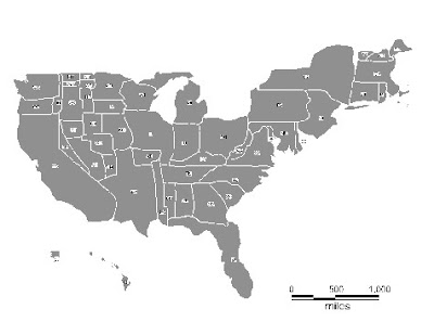

Link to this cartogram
In the cartogram the relative sizes of the states have been distorted to reflect their respective number of electoral votes
Flow Map
The Flow map is a map that is used to show movement or flow of some entity or property. Flow is usually represented by some graphical element overlaying a base map.


This flow map show the flow of illicit drugs throughout the world. Three flow of cocaine, heroin, and marijuana are represented by different color arrows and dotted lines. Countries producing the drugs are shown in the respective color.
Proportional Circle Map
Proportional circle maps are thematic maps. These maps use circles of sizes proportional to the data being displayed to overlay pertinent areas the map.


This proportional circle map is made from Census Bureau data. It depicts the relative size of United States Hispanic populations by county. Larger circles indicate Larger populations at their centers.
Chloropleth Maps
A chloropleth map is a thematic maps. Chloropleth maps use colored areas on the map to represent some attribute or degree of attribute of the area colored.

This chloropleth map shows the leading number of church bodies by county throughout the United States. Each denomination is shown by a unique color. This map gives a clear representation of where the different denominations are concentrated across the United States.

This chloropleth map shows the leading number of church bodies by county throughout the United States. Each denomination is shown by a unique color. This map gives a clear representation of where the different denominations are concentrated across the United States.
Sunday, January 23, 2011
Hypsometric Maps
Hypsometric maps are a type of topographic map in which shading is used to represent elevation. The shading varies continuously throughout the elevation scale.

This map uses hypsometric shading to show elevation on the island of Cuba. Dark green is used to represent lower lying areas, lighter greens changing into yellows and then browns indicate the higher elevations.
Link to this map to see how it was created: http://blog.isallaboutmath.com/2009/02/14/topographic-map-of-cuba-produced-with-srtm-data/
PLSS maps
PLSS (Public Land Survey System) maps show the subdivision of public land in the United States. It is a uniform rectangular system of blocks to which all areas of public domain are subjected. The blocks are laid out from meridians established across the United States. The Bureau of Land Mangement is responsible for the PLSS system.
 Above is an example of the PLSS grid as applied to public lands. Lots are numbered from west to east and then east to west in next row down.
http://www.petroleumgeographics.com/products/public-land-survey-system-plss-land-grid/
http://www.petroleumgeographics.com/products/public-land-survey-system-plss-land-grid/
Cadastral Map
A cadastral map is a map which shows information about property ownership within a geographic area. Maps of this type can be found in regional government offices and are of public record.

This cadastral map is a plat map of part of the city of Alemeda. It shows the devision of city blocks into numbered lots.
Link to Alemeda: http://alamedahistory.org/the-map/

This cadastral map is a plat map of part of the city of Alemeda. It shows the devision of city blocks into numbered lots.
Link to Alemeda: http://alamedahistory.org/the-map/
Histogram
A histogram is a graphical diagram showing the distribution of some type of data. Histograms usually appear
as bar or line graphs.

This histogram from Abobe photoshop shows the tonality of a particular image. The black area represents the distribution of the total number of image pixels over the tonal range of the image. If the majority of pixels were to the left the image would be dark, if they were all at right the image would be light.
View more about Photoshop's Histograms
as bar or line graphs.
This histogram from Abobe photoshop shows the tonality of a particular image. The black area represents the distribution of the total number of image pixels over the tonal range of the image. If the majority of pixels were to the left the image would be dark, if they were all at right the image would be light.
View more about Photoshop's Histograms
Thematic Maps
Thematic maps illustrate a particular characteristic within a geographical area. Thematic maps usually are used to show the distribution or density of a particular physical or statistical characteristic within a geographical area.

In this example colors and graphics are combined to describe the Land Reserves of Island of Hawaii.
See this thematic map here.

In this example colors and graphics are combined to describe the Land Reserves of Island of Hawaii.
See this thematic map here.
Subscribe to:
Comments (Atom)